")
First things first, how long does this kind of drawing take you to do??
It takes a little over 80 hours of drawing time to complete a 10″ x 10″ five-sided drawing… and because the entire composition is improvised, many more hours are spent meditating on the overall feel of the work, fundamental compositional decisions and the development of the individual creature-forms and how each interfaces with the canvas as well as each other.
Over how many months?
I’d say about 4 months.
Do you create any sketches beforehand?
The generative process that eventually yielded this drawing style did start with a test canvas. I used that test canvas to formally explore certain kinds of shapes and patterns and color combinations. I tried to curate myself as little as possible while drawing on this test canvas… if it moved me, I drew it. Or tried to anyway.
How long were you working with the test canvas?
Approximately 3 months after starting the test canvas I began drawing tightly collected circles in pencil… it was in response to an idea I had about how everything is made of the same “stuff”. A simple realization, all things considered. The pencil marks created a beautiful texture on the canvas… I loved it! And I thought I’d reached my moment of inspiration… but about a week later I realized it wasn’t quite enough.
What did you feel was missing?
Well, I’d really wanted the drawings to resonate “celebratory” and the pencil marks just weren’t enough for some reason. Their voice didn’t quite move the air enough for me. So, I decided to try tracing some of those pencil circles with a fine tipped black ink pen.
")
But…?
But it wasn’t enough either… until I stirred in some specific crisp “celebratory” colors in each of those circles. Then I knew I was where I needed to be in order to create the series of drawings that I wanted to create. Their expressive minimalism said everything I had been wanting to say but didn’t know how.
The effect is really beautiful and fun.
Wow… thank you so much.
My eyes want to jump all around the canvas when I’m up close but the further away I am the more the forms become the focus.
I really enjoy works that have more than one spatial life, whose meaning is distant-dependant. I’m drawn to the real-life metaphor behind it I guess. So, I chose to group the circles as tightly as I did in order to achieve a formal visual harmony when viewed at a certain distance… but then obviously as you approach them you begin to increasingly distinguish the four colors.
Like Impressionism… Pointillism?
Very much so. Except I’m drawing a dimensional parameter for each mark and my interests don’t lie with creating a realistic picture when viewed from a certain distance. Also, like you said, your eyes want to jump all around the canvas when you’re up close… your brain enjoys following certain colors/patterns in the drawing that particularly resonate with you, whether you are consciously aware of it or not. And I like thinking that that aspect to these drawings is going to be slightly different for each person.
In your artist statement you mention drawing fictitious creatures whose names your parents would invent… which I found very interesting… how do those creatures compare to the ones in these drawings?
I think the main difference would be that the ones I drew when I was a kid, not to be absurdly self-evident, were created from a kid’s perspective. They were drawn with a less coordinated hand as well as invented from a less multifaceted creative mind. Which is not to say that I didn’t include details in each of them or that they were somehow patently “cute” or wholly unsophisticated. But simply that the creature-forms that are in this series of ink drawings harbor a more mature understanding of what’s possible when inventing them.
And the formal simplicity in them, is that an abstract nod to anything in specific?
I would say, yes, it is. It’s a nod to both seeing things for what they actually are, which is usually far simpler than we first assume, and to a sort of fundamental visual aesthetic (that is grounded in the idea that we build up everything around us by combining parts into coherent wholes) meets scientific theory regarding the direct relationship between relative size and structural diversity at the cellular level. My interest is in displaying that cellular level.
")
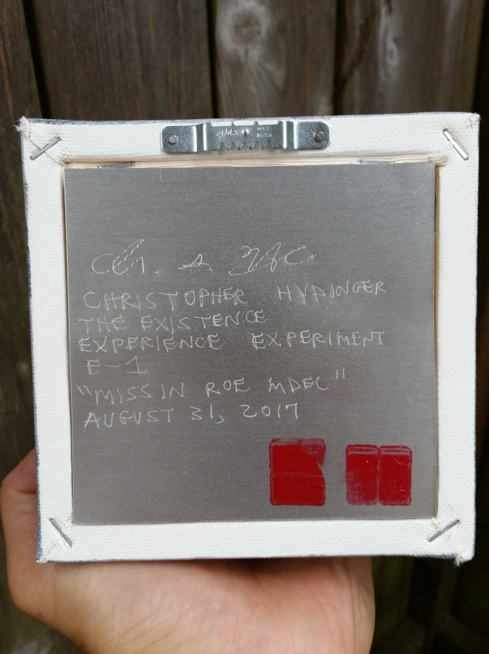
Each drawing has a metal plaque of sorts attached to the back. What is the reason for including this feature?
The metal plaque came from my interest in including the signature and other info in a way that was concept-specific but also as time-resistant as possible. The metal is aluminum, for example… rust-proof even in full-exposure outdoor conditions. Also, I chose to etch into the metal rather than apply inks onto the surface.
And the black ink marks and the size of the plaque?
That is a C and an H, initials for my first and last name. I chose to include those stamp marks because the tradition of the ink stamp, or the seal as it’s known in east asian art, really resonates with me as a beautiful yet simple way to identify authorship. I consider it the formal signature of each of these drawings. The size of the plaque came from my desire to have clearly legible etched text. Not being able to read the text after going to such lengths conceptually would have been inexcusable! Haha!
I suppose you’re right. Haha!
But also I wanted the plaque to have a substantive physical merit… a visual weight and presence all to itself beyond merely the surface on which the info was present.
Would you like to share any final thoughts about the drawings?
I have really enjoyed the meditative experiences that this drawing style has allowed me to have while unconsciously adding black circle after black circle. And while it’s admittedly also mentally and physically the type of focused task that can feel arduous, it is ultimately a rewarding feeling… not unlike any chosen mental and physical challenge any of us attempt and find ourselves having endured, I suppose. Oh, and I wouldn’t turn down a sponsorship from Sakura for some Micron pens!
")
Artist Statement used on-site with the works:
“I have always gravitated toward nuance, hyper-detail, fundamental units that when compiled form something recognizable. With these drawings, I am attempting to weave that affinity with a performative approach to drawing, the act as improvisation, as meditation, as physical and mental challenge, as repetitive ritual.
The four colors, one for each of the four nucleobases in DNA, is my attempt to colorfully visualize the idea that all known living organisms appear to be composed of the same building blocks.
The title of this series of ink drawings, The Existence Experience Experiment, comes from my belief that existence itself is part of a mega-evolutionary process… another potential being tested, weighed as beneficial or not, sustainable or not. ‘Ahadu’ is the first work in the series.
When I was a young boy and my parents and I were in the family car for extended periods of time, they would keep me occupied by giving me a pad of paper and a pencil. They would say a name of a fictitious creature and I would commence drawing what I thought that creature might look like. I drew phlegataurites and elibrisaurii and petrawammedes for what seemed like hours. The creature-forms in these drawings are conceptually inspired by the ones that my parents invented.”
———
The following is one of thirteen drawings from the social context-specific work, ‘MISSIN ROE MDEL’. This multi-canvas piece was ideated and created exclusively in honor of Gloreen “Glo” Raineri, the founder of the legendary Glo’s Café and Seattle social icon. Consisting of thirteen 5″x5″ canvases, each a creature-form embellished letter spelling the phrase MISSIN ROE MDEL (the G, L and O consciously excluded), it was featured in Glo’s Café for the month of September.
The back of each canvas features an aluminum plate, etched with signature, printed name, series title, individual title, work title, date and hand-stamped initials signature “C” and “H” in red ink. All six sides have been applied with three layers of a satin varnish for durability, texture and appearance.


Artist Statement used on-site with the works:
“Having lived for many years within stumbling distance of this establishment, and enjoying their in-house corned beef hash in my pre-vegetarian years, I cherished getting a table knowing I might have the rare opportunity to see Glo, in person, even if just for a few moments.
Knowing relatively little about this person, minus of course how incredibly respected she appeared to be by all that orbited this place in one way or another, I realized something one time while waiting outside for our table: she’s perhaps the perfect example of a truly respectable citizen, a real icon, a real rock star, a real role model.
So the one time, calmly seated but distracted by my hunger and tablemates’ presence, that she was standing beside me, prepped to take my order, I somewhat froze. Glo was asking me what I would like to eat, in the establishment that bears her name, today, right now. And I remained a bit frozen as I visibly blushed, my combination of admiration and respect and surprise bursting through, while trying to speak my order out loud to her.
I just wanted to jump up and hug her. That’s really all I wanted in that moment. To say thank you. For being her.
This series of 13 individual ink drawings, each a creature-form embellished single letter spelling the phrase “MISSIN ROE MDEL” was ideated and created exclusively in her honor.”

Artist Statement from press release:
Cross-disciplinarian Christopher Hydinger Debuts Pro-Environmental Mural: ‘Breaking News: Alien Messiah Engages Portal, Presses Delete’
West Seattle — Christopher Hydinger invites you to experience their new pro-environmental mural, ‘Breaking News: Alien Messiah Engages Portal, Presses Delete’ at West Seattle’s world-class art alley West Side Wall (located behind the Rite Aid at 5217 California Ave SW 98136). Installed at the north end of the alley, this large-scale drawing created using only small paint pens took over 65 hours to complete and vibrantly visualizes in great detail the absurdity of a Messiah coming to Save Us illustrated through the comically dramatic lens of an Alien Messiah at the moment they have decided to press the Delete button.

“Compositionally, the viewer is able to enjoy the expansive view through the Portal and into the Universe of the Alien Messiah, but because the floating Delete button (designed using the principles of chromostereopsis to create a no-glasses-needed 3D illusion) has been oriented facing the Alien Messiah (all “recycle” icons feature arrows pointing clockwise), this also gives the viewer the physical sensation of simultaneously inhabiting the inside of something while also looking out from it (a world inside a box, a cage, a computer, a more expansive ecosystem). Combined with the larger-than-life presence of the beautiful but intimidating Alien Messiah and the ominously designed Delete button, this is intended to create an unsettlingly eerie shock. But hopefully this shock will inspire a deeply motivating pro-environmental perspective to emerge. And just in time for Halloween!”

“This work needed to be in the public eye, accessible, not bottled up in a gallery, big, bold, with a pinch of comedy and completely unafraid to spotlight the truth. The truth that I’ve tried to extremely vibrantly illustrate? We genuinely must focus on working to Save ourselves, each other and the only planet we have. No one and nothing is going to do it for us.”


