Being a cross-disciplinary artist and designer, do you find the temptation to play with the relationship between 2D and 3D an appealing one?
Oh, absolutely… I am deeply, deeply attracted to that angle of approach.
Any particular combos that you feel consistently drawn to?
I’m especially drawn to stirring in disciplines such as typography design, which has been an interest of mine since I was very young.
For example?
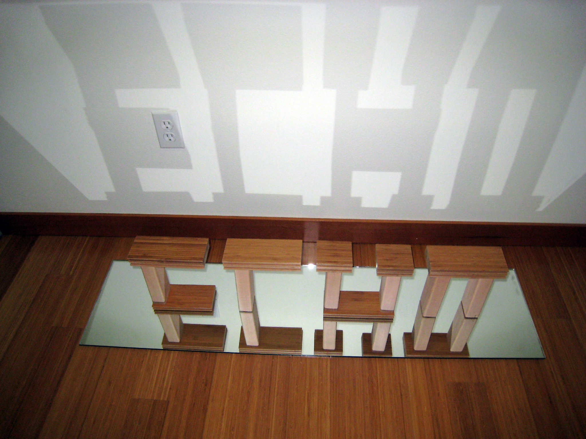
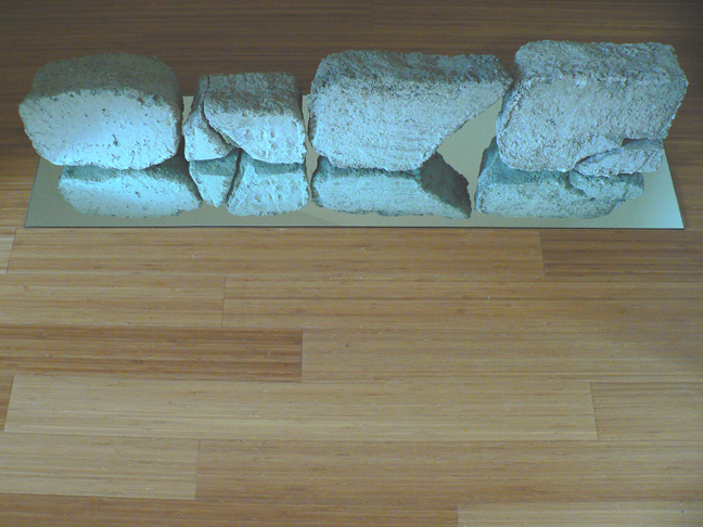
For example, in the three featured images: each are a single word fabricated using specific materials and expressed using a specific typeface I created for each word+material combo. And while not something that you will realize at first, you are actually reading a 50/50 3D/2D word. The reflection in the mirrored glass is so close and is therefore so realistic that it does not immediately register as “2D” while you are reading it… our brains just do not work like that. It is, according to your functioning brain, wholly a 3D object.
But then it sinks in!
Ha… good one. But, yes, it takes a few seconds to a few minutes before it fully registers that you are not looking “into” and “through” anything, but just a simple reflection carefully created using a specific footprint and shape of mirrored glass and an extremely carefully sized object resting on that mirrored glass.

And how did you come to these three works, as far these materials, that is?
These three works were created exclusively for a group exhibit I was invited to participate in called bridge[d]… hosted by both the architectural firm, Johnston Architects, and the developers, FootPrint Developers, and taking place in their Footprint at the Bridge eco-townhomes in Fremont just off I-99. And while I was being shown around the facility, I realized that it was the facility itself that was moving me to simply echo its design intent.

So, did you literally make a list in your head of what was moving you that day?
No, I literally made a list on paper actually! And, long not-so-intriguing-story-short, I ended up with a short-list of ABS, concrete and the two chief woods that were being used, cedar and bamboo.

Okay. But how did that become these three works?
This is going to sound somewhat math-y on a certain level, but leaning on my longtime fascination with reflection and patterning, I realized that there are certain letters in the english alphabet that are horizontally symmetrical and some that are vertically symmetrical. I made a list of these two groups, and then proceeded to make a list of the words that could be made using those letters. Three of the words from the horizontally symmetrical were ‘choice’, ‘echo’ and ‘bike’.
Did those move you more than the others?
No, not exactly. I just found that those three words really, really mirrored the three materials that had also moved me.
Mirrored, huh? Pun intended?
Definitely not. I have an exceedingly strict no-pun policy. Across the board.

Haha! Got it! And the three typeface designs themselves came from…?
This for me was where the three works began to get sincerely involved. I meditated on each typeface design for hours upon hours on end. And I realized that to truly come to a decent place with each one, I would need to adopt a creative process that mimicked each material and how it might be employed as well as how each word related to its purpose within the facility. After that, I adopted three different creative processes, went about developing each word’s typeface via that process and fabricated each work accordingly.
Wow… that does sound involved.
Yeah, it really was a lot to ask of myself… especially considering the timeline for this mini-project, zero to staging it for exhibition, was about one month.

One month?!
Yeah, I know. Completely not only a bit hyperspeed, but absolutely not my default style at all. I much prefer to investigate concept, develop form and then fine tune and present it. Thankfully, there was so much that I felt personally inspired by surrounding these eco-townhomes and their architects and developers, that I just felt brutally compelled to push myself to make it happen on time for the grand opening.
And this was a group exhibit, right?
Yes. And I was really honored to not only be asked to participate but to have my work in the company of so many other wonderful and creative people’s work. It was worth every moment of stress and introspection and trial-and-error and surprise and meditation and reconsideration.
Artist Statement used on-site with the works:
THE BASICS: I was moved by the complex’s heartfelt features, especially the more poetically ambitious ones, and felt compelled to create site- and client-specific work based on those engaging attributes.
THE DETAILS: There is a sort of magic happening here. It’s in the walls and floors. It’s a game whose tagline might read ‘Now You See It, Now You See It Again!’ and it’s both mechanically sublime and deafeningly relevant. Rainwater is directed thru pipes from the rooftops into a cistern in the basement, the collected water to be later employed during the not-so-rainy months. The result is simple, the sentiment humanitarian. Also, the encouragement of an inside/outside lifestyle is evident in the complex’s purposely intimate relationship between its built environment and its designed landscape. The two are organically intertwined so as to blur the line separating the Natural and the Synthetic as they exist in urban spaces. This causes a loss of hierarchy often associated when perceiving the Values of synthesized materials versus the Values of natural materials. And so when intertwined neither is capable of taking center stage… the resulting duet a lesson in mutual respect producing a mutually beneficial outcome. There is in addition to these characteristics the very matter-of-fact stance that the complex takes as a metaphor for what it means to exist in an urban environment. The sounds of passing automobiles, for example, become a celebration of sorts; they are a subtle reminder to consciously remain in touch with your personal impact on the world surrounding us all.
The wood and bamboo used to create ECHO were surplus materials from the site itself. The ABS piping and concrete were inspired by the complex’s construction elements. The mirrored glass represents both Nature and the healing magic inherent in introspection, an activity vital to sustaining peacefulness in the urban environment.
THE THANK-YOUS: Johnston Architects, Footprint Developments, the other artists, and especially Jennifer Wittlinger for making this truly unique group exhibition a reality. Each of the three pieces is dedicated to everyone who contributed in some fashion to the completion of Footprint at the Bridge.
•••••••••
The following 3D typography sculpture, KICKBOX, is the finished piece I had originally conceived/created for the 2014 Valentine’s Day group exhibition at Jinxed Gallery in Philadelphia, PA. I did not end up submitting it due to several factors, but did end up submitting the interactive multimedia sculpture BookMapPump.

